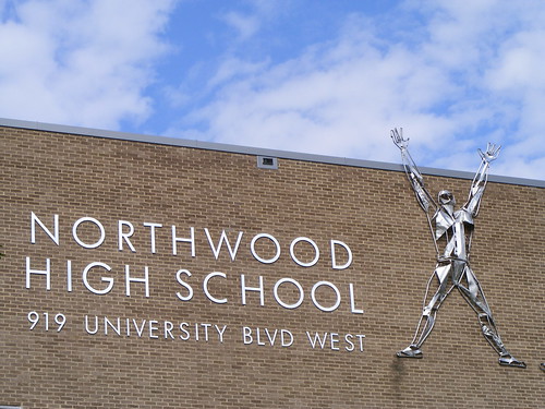
I like my fonts crisp and clean, especially if they're going to announce an important building, like a high school on a major street. That's why I love passing the recently-reopened Northwood High School. Between the vaguely Modernist architecture (largely covered up by ongoing renovations) and the metal figures flying across the façade, you can tell it's a product of the Sixties. Using a sans-serif font that's hard to discern (Is it Futura? Arial? Or Helvetica, like the documentary?) is not only honest to the era in which the school was built, but gives the place a dynamic, progressive air. Not surprisingly, Northwood is the Downcounty Consortium's media-and-technology school.
Public schools say a lot about their community. A distinctive sign foreshadows a distinctive neighborhood. So what do the typical plastic signs say? Not as much as you think you could with those little movable letters.
No comments:
Post a Comment