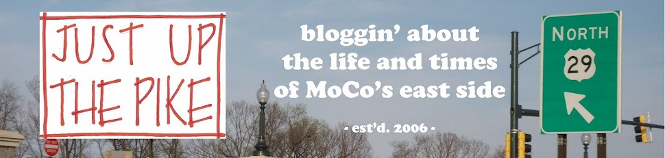
Last week, we talked about the new design of the Silver Spring Library, set to rise at the corner of Wayne Avenue and Fenton Street. While I wrote about the proposed building's aesthetics and changes to the layout, some of the commenters on Greater Greater Washington took issue with the font of the sign at the corner, which spells out "Silver Spring Library" vertically. "Please, for the love of Gutenberg, do not despoil the facade of this wonderful new building by setting the 40-foot "Silver Spring Library" sign in Arial," pleaded commenter Brad.
The font of a sign certainly isn't the most important detail on a library that won't even open until 2014. But it does raise the question of the role fonts play in how we perceive the world.
For instance, sans serif fonts (the letters don't have "serifs," or tails) can make something appear fresh and modern. In East County, you'll find sans serif fonts on the entrance sign for Hammond Wood, a mid-century modern neighborhood in Wheaton, this sign at the Praisner Library in Burtonsville, and on Northwood High School's new sign, which uses Futura to make its dated 1960's-era campus feel fresh and forward-looking.

Serif fonts, in which the letters do have tails, can create a historic or refined air. this sign at the Courts of Woodside development, where century-old houses mingle with new construction. Compare that font to this one used to sell new homes in Arts District Hyattsville. The homes may be similar, but in they're in very different locations and the developers may be reaching out to different buyers. It's unlikely, for instance, that buyers in Woodside want to live in a place that's comparable to U Street, hence a more traditional-looking font.
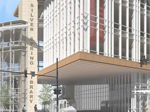
Sometimes, fonts can be used playfully, like on this sign for Fenton Street Market, which uses Rosewood. It's an old-looking font that still looks playful. Here it is on the library:
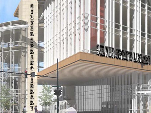
Of all of the new buildings going up in downtown Silver Spring, the library will probably see the most use, as people go there to check out books, surf the web and hold community meetings. As a result, it bears the most responsibility of any building in the business district to present itself the right way. What font do you think is appropriate for a new library? (Or should we just set this aside and go back to complaining about that gosh-darn pedestrian bridge?)
4 comments:
Comic Sans.
Futura is where it's at.
Helvetica. Tie it in to the civic building.
In any case, it's a crime against typography to stack the letters vertically - the different widths of an "I" vs. an "E," for example, make the column of type awkwardly shaped and difficult to read. I hope hope hope I don't see this in 2014!
Post a Comment